
- January 22, 2024
- By Paula Villasante
- Data Processing, Survey Methods
Have you ever received a dataset for analysis, thinking it went through rigorous quality checks, only to spot some sneaky bad data? This is particularly true with online surveys, which tend to elicit invalid response patterns such as straight-lining, i.e. selecting the same answer for multiple consecutive questions, often indicating disengagement or lack of attention to the survey content.
In this article, we will explore how we can use cluster analysis to unveil anomalous response patterns within complex datasets. By segmenting the data into distinct clusters, we aim to catch odd response patterns and outliers. This approach not only enhances our understanding of the inherent structure of the data but also facilitates the early detection of potential issues, ensuring more accurate and reliable analysis. Let’s go through it!
Environment Setup
To start, we will load the necessary R packages by using the pacman package management tool. This will import the following required packages.
pacman::p_load(haven, dplyr, tidyr, knitr, gt, kableExtra, kamila, pollster, devtools,
        responsePatterns, xgboost, ggplot2, reshape2, Ckmeans.1d.dp, rgl, magick)
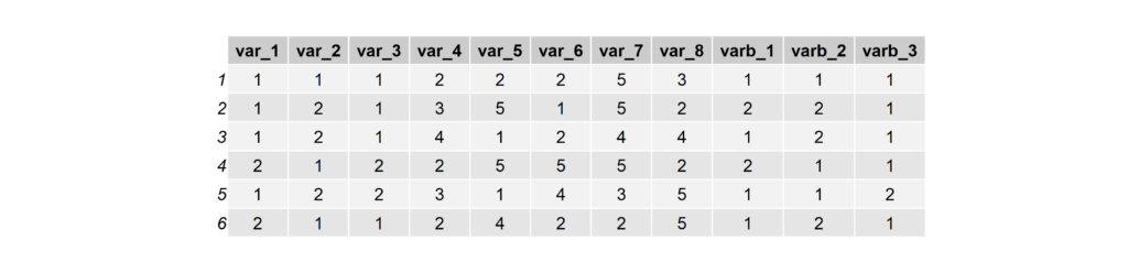
Generate Simulated Data
We begin by simulating data that can be used to test the validity of the cluster analysis technique. The simulated data should create groups that are internally homogeneous and externally heterogeneous. We do this by using a random data generator to generate three datasets, each with its unique bias. After that, we will combine them into a single dataset for analysis.
Each of the three generated data sets has distinct characteristics, such as different ranges of values for certain variables and varying patterns in the binary variables. By applying clustering techniques to these data sets, one can assess how effectively the method identifies distinct groups or patterns, differentiates between them, and handles the variability within the data. This is crucial for validating the robustness and accuracy of clustering algorithms in real-world scenarios, where data often exhibit varied and complex structures.
# Function to generate simulated data
generate_data <- function(var1_range, var2_range, var3_range, binary_constant = FALSE) {
  data.frame(
    var_1 = sample(var1_range, 1000, replace = TRUE),
    var_2 = sample(var2_range, 1000, replace = TRUE),
    var_3 = sample(var3_range, 1000, replace = TRUE),
    var_4 = sample(1:5, 1000, replace = TRUE),
    var_5 = sample(1:5, 1000, replace = TRUE),
    var_6 = sample(1:5, 1000, replace = TRUE),
    var_7 = sample(1:5, 1000, replace = TRUE),
    var_8 = sample(1:5, 1000, replace = TRUE),
    varb_1 = ifelse(binary_constant, 1, sample(1:2, 1000, replace = TRUE)),
    varb_2 = ifelse(binary_constant, 1, sample(1:2, 1000, replace = TRUE)),
    varb_3 = ifelse(binary_constant, 1, sample(1:2, 1000, replace = TRUE))
  )
}

# Create simulated data for three different conditions

set.seed(123)
simulated_data_c1 <- generate_data(1:2, 1:2, 1:2)
simulated_data_c2 <- generate_data(3:5, 3:5, 3:5)
simulated_data_c3 <- generate_data(1:5, 1:5, 1:5, binary_constant = TRUE)

# Concatenate three datasets
simulated_data <- rbind(simulated_data_c1, simulated_data_c2, simulated_data_c3)

# Check the structure of the simulated database
head(simulated_data)
Identify Response Patterns Using Kamila
Next we will prepare the data for cluster analysis. The Kamila algorithm is a clustering technique specifically designed for mixed data. Survey data typically contain a combination of binary, nominal and ordinal variables. Kamila offers a robust and effective way to identify underlying patterns and groupings by accommodating the unique distribution and relationships inherent in such mixed-variable datasets.
First, we prepare the data for Kamila. This means splitting continuous and categorical variables into separate data frames. Then, we use the elbow method to explore the optimal number of clusters in our data, which we can then extract for exploration. Let the adventure begin!
# Prepare data for Kamila
cont_vars <- subset(simulated_data, select = -c(varb_1, varb_2, varb_3))
cont_vars <- data.frame(lapply(cont_vars, function(x) as.numeric(as.character(x))))
cat_vars <- subset(simulated_data, select = c(varb_1, varb_2, varb_3))
cat_vars <- data.frame(lapply(cat_vars, factor))

# Run elbow method
k.max <- 8
kamRes <- kamila(cont_vars, cat_vars, numClust = 2:k.max, numInit = 10,
calcNumClust = "ps", numPredStrCvRun = 10, predStrThresh = 0.5)
plot(2:k.max, kamRes$nClust$psValues)
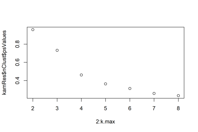
We finally extract the clusters, specifying three as that is the number of distinct populations we have created. This choice is not obvious from the elbow method though, which is the reason why we always advise exploring different k values around the elbow.
 # Extract clusters
set.seed(123)

kamila_clusters <- kamila(cont_vars, cat_vars, numClust = 3, numInit = 10,
calcNumClust = "none")
kamila_clusters_labels <- factor(kamila_clusters$finalMemb, order = TRUE)
simulated_data$kamila_clusters_labels <- kamila_clusters_labels
Cluster Sizes
In the following code chunk, we explore the size of the clusters with simple frequency counts of the clusters obtained from the Kamila clustering algorithm. The clusters have similar size, which is encouraging since we simulated three distinct datasets of equal size.
freq_counts <- table(kamila_clusters_labels)
barplot(freq_counts, col = "skyblue", main = "Frequency Counts", xlab = "Cluster Labels", ylab = "Frequency")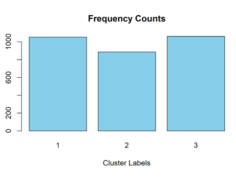
Describe Clusters on Basis Variables
In the following code segment, we explore the distribution of specific variables by cluster, focusing on those that should show clear differences across clusters.
# Variables of interest
basis_vars <- c("var_1", "var_4", "varb_1")
simulated_data$weight <- 1

# Iterate over the variables
for (variable in basis_vars) {
    crosstab_result <- crosstab(
        df = simulated_data,
        x = !!sym(variable),
        y = kamila_clusters_labels,
        weight = weight,
        pct_type = "col"
    )
    crosstab_result <- crosstab_result %>%
        mutate(across(where(is.numeric), ~round(., 2)))
    print(crosstab_result)
}


The resulting frequency tables indicate the successful retrieval of the simulated datasets. For example, we simulated var_1 to range:
- Between 1 and 2 for dataset 1
- Between 3 and 5 for dataset 2
- Between 1 and 5 for dataset 3
Based on the frequency table for var_1, it seems obvious that the cluster algorithm has successfully identified the following correspondences:
- Dataset 1 = cluster 3
- Dataset 2 = cluster 2
- Dataset 3 = cluster 1
Likewise, we don’t see cluster differences for var_4 as expected, and we see that varb_1 is restricted to values of 1 for cluster 1, also as expected.
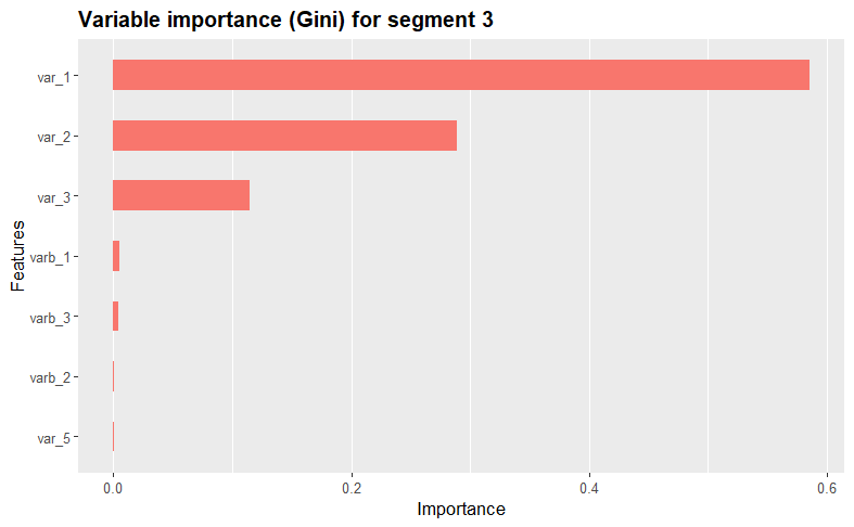
Variable importances
We further assess and visualize each variables’ importance within the clusters using the XGBoost algorithm. The function iterates through each unique cluster in the dataset, creating binary dummy variables to isolate the current cluster during model training.
By using XGBoost, the function then trains a model, displays a summary, calculates variable importance using the Gini index, and visualizes the results using the xgb.ggplot.importance function from the ggplot2 package. This process repeats for each cluster, providing insights into the most influential variables for each cluster. Take a look at the results!
 # Variable importance function based on xgb
varimp <- function (data, clusters) {
  cluster_list <- sort(as.numeric(unique(as.character(clusters))))
  for (i in cluster_list) {
    cluster_dummy <- ifelse(clusters == i, 1, 0)
    xgb_train = xgb.DMatrix(data = data.matrix(data), label = data.matrix(cluster_dummy))
    clusters.xgb <- xgb.train(data = xgb_train, max.depth = 3, nrounds = 10)
    summary(clusters.xgb)
    importance_matrix = xgb.importance(colnames(xgb_train), model = clusters.xgb)
    # write.csv (importance_matrix, paste0("varimp_cluster_", i, ".csv"))
    # print (paste("Variable importance for segment", i))
    print(xgb.ggplot.importance(importance_matrix, n_clusters = 1) + ggtitle(paste("Variable importance (Gini) for segment", i)) + theme(legend.position = "none"))
  }
}
varimp(simulated_data[, 1:11], kamila_clusters_labels)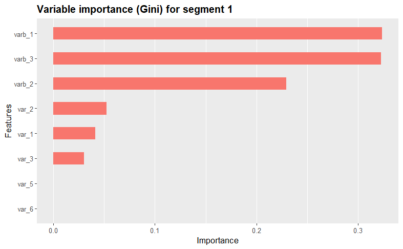

Variable descriptives
To see the variable distributions within each cluster, we create the boxplots_labels function. This function generates and displays boxplots for each variable as follows.
# Boxplot functionboxplots_labels <- function (mydata, cluster_var) {
  mydata[["constant"]] <- 1

  clusters <- sort(as.numeric(unique(as.character(cluster_var))))

  for (i in clusters) {
    melt_data2 <- melt(mydata[cluster_var == i, ], id.var = "constant")
    melt_data2 <- melt_data2 %>% group_by(variable)
    p <- ggplot(data = melt_data2, aes(x = variable, y = value)) +
      coord_flip() +
      geom_boxplot() +
      ggtitle(paste("Segment =", i))
    print(p)
  }
}
boxplots_labels(simulated_data[, 1:11], kamila_clusters_labels)
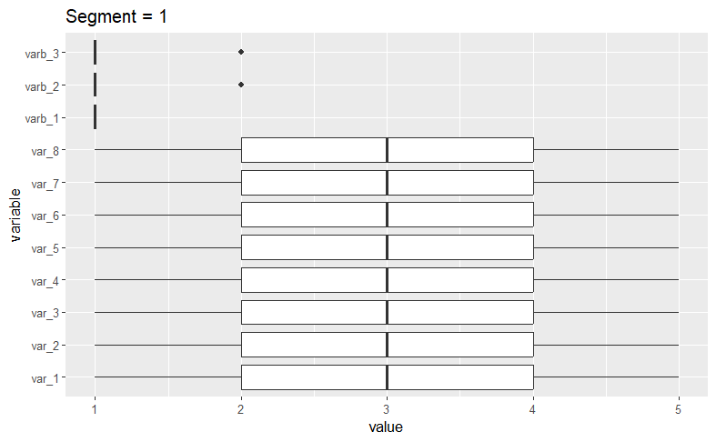
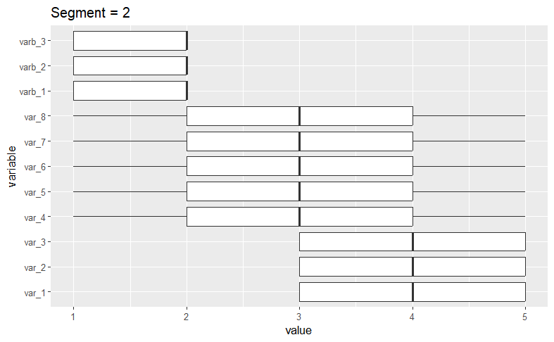
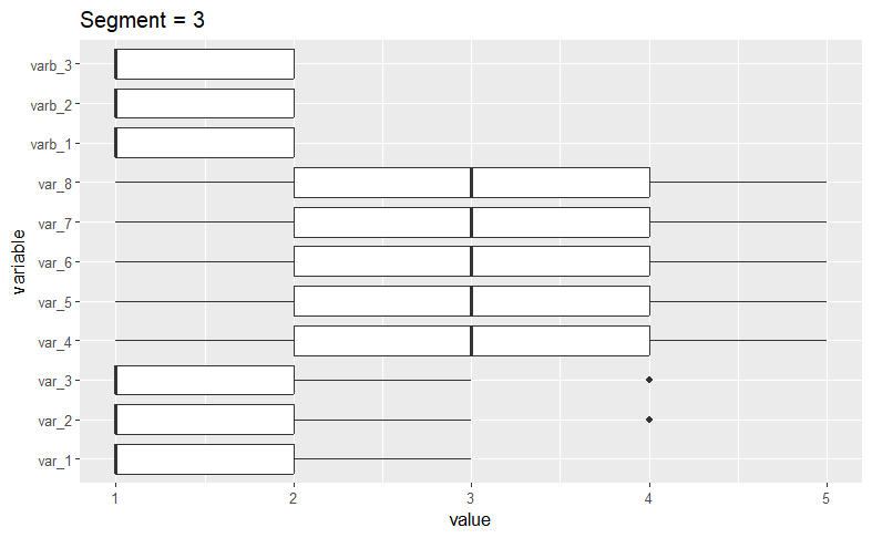
A quick visual examination confirms our initial assertion that the algorithm has successfullly isolated the datasets we generated.
Principal Component Analysis
Finally, we use Principal Component Analysis (PCA) to visualize clusters. This facilitates a more manageable and interpretable representation of the underlying structure of response patterns in our data, validating that we have indeed identified the clusters. This visualization also assists in identifying potential borderline cases.
# Perform Principal Components Analysis (PCA)
pca_result <- prcomp(simulated_data[, 1:11], scale = TRUE)

# Extract the first three principal components
pc_data <- as.data.frame(pca_result$x[, 1:3])

# Add clustering labels to the PC data
pc_data$cluster <- as.factor(kamila_clusters_labels)

colors <- c("royalblue1", "red", "green")

# Static chart
plot3d( pc_data$PC1, pc_data$PC2, pc_data$PC3, col = pc_data$cluster, type = "s", radius = .1 )

# We can indicate the axis and the rotation velocity
play3d( spin3d( axis = c(0, 0, 1), rpm = 20), duration = 10)

movie3d(
  movie="3dAnimatedScatterplot",
  spin3d( axis = c(0, 0, 1), rpm = 7),
  duration = 10,
  dir = getwd(),
  type = "gif",
  clean = TRUE
) 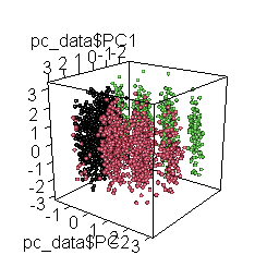
The rotating 3D chart, besides mesmerizing and cool, also allows us to examine the coherence of the emerging solution and the accurate retrieval of the original datasets.
Having identified these three distinct response patterns in the combined dataset, we can begin to question whether they make sense or indicate a potential problem with the way the data were collected.
If you have any questions or comments, please feel free to reach out!
About Rosan International
ROSAN is a technology company specialized in the development of Data Science and Artificial Intelligence solutions with the aim of solving the most challenging global projects. Contact us to discover how we can help you gain valuable insights from your data and optimize your processes.